Khan Academy
Redesign & Analysis
Date
April 2020
Tools
Figma, Google Drive
Description
During my Information Architecture class I took with Yee Eun Yoon at SCAD, we were tasked with picking an existing website and conduct a thorough analysis and redesign of the platform's Info Arch.
This project was created in the span of two weeks. During that time, I was able to understand Khan Academy's current platforms and IA, identify the strengths and weaknesses of their current system, and propose three critical improvements towards their current IA.
Links
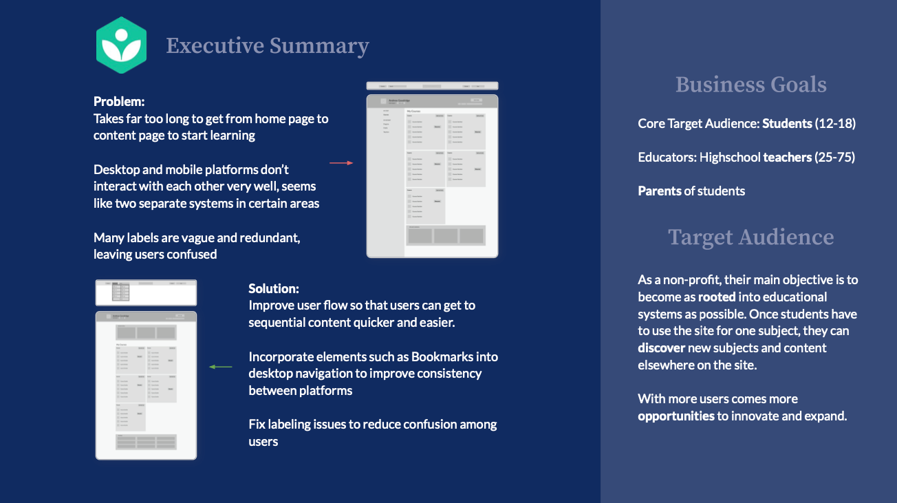
My objective with this project was to conduct a thorough analysis and redesign of the Khan Academy's Info Architecture. I split up this assignment into understanding Khan Academy's current platforms and IA, identifying the strengths and weaknesses of their current system, and resolving their weaknesses with three critical improvements.
Understand
Khan Academy is a non-profit educational organization that provides a set of online tools that help educate students. They create content in the form of articles and video lectures, as well as provide exercises and assessments that educators can use to track students’ progress.
Khan Academy has three main values which they follow:
- Empower students with free, “world-class” education, accessible to anyone
- Utilize technology to provide personalized curriculums
- Inspire students to find new passions in learning
Khan's users can be split up into two different types of users:
- Students: Completing lesson content, which entails watching videos, reading articles, and taking quizzes
- Highschool teachers/Parents: Tracking students’ progress on lesson content
As a non-profit, their main objective is to become as rooted into educational systems as possible. Once students have to use the site for one subject, they can discover new subjects and content elsewhere on the site. With more users comes more opportunities to innovate and expand.
Identify
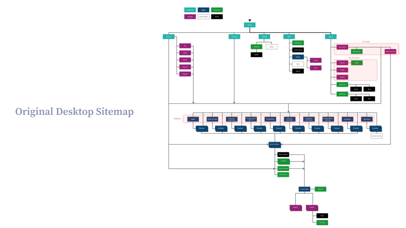
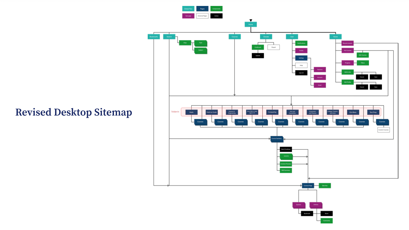
I chose to focus on their desktop platform since it's their main platform and had the most issues. Shown below is a diagram of their current blueprint for both of their platforms:
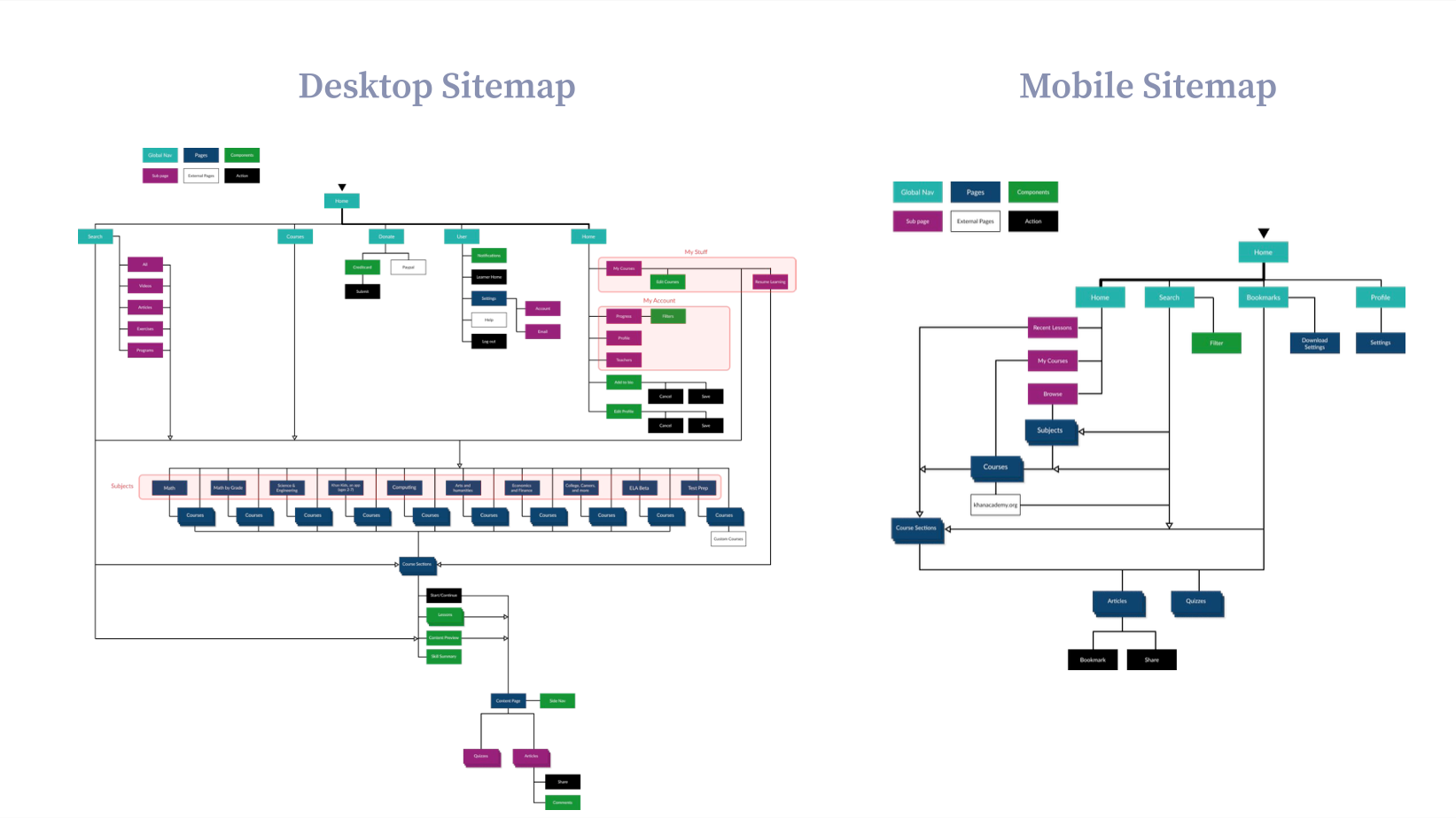
After rebuilding their blueprint, I analyzed and took note of various aspects of their information architecture:
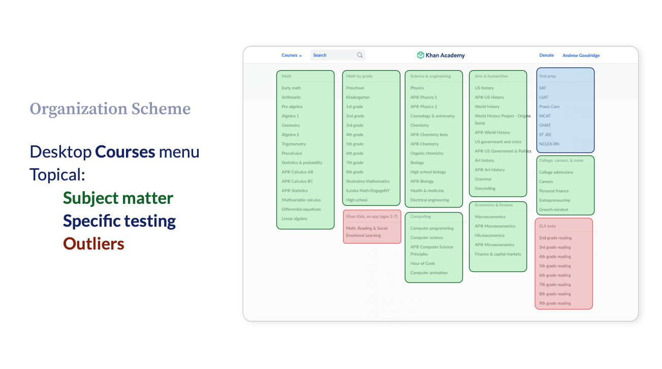
Organization Scheme
Khan Academy uses an exact organization scheme, generally grouping content from general to specific, starting from Subject Matter and ending at a specific piece of Lesson content.
I also noticed that while organization scheme is an easy experience for long time users, it can be confusing for new users. For instance, while their course sections in the navigation are grouped topically, they have a range of granularity which makes it confusing to find a specific course.
Organization Structure
The organization structure of the desktop platform is generally has a good balance between breadth and depth. It begins as hierarchical system, then once user gets into content, changes to sequential system.
The most common user flow is going from the Home page to the Content page. Since this is the most common flow, it should be as efficient and quick as possible. However, there are several points in the blueprint of the site which bottleneck this flow for users.
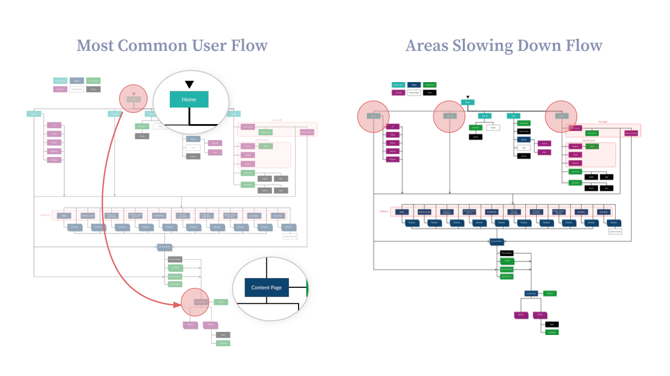
The beginning structure is a Polyhierarchy system, which means there's multiple ways to get to “Courses” and “Course Sections”. Most accessible routes are through the "Courses" tab or "My Stuff". While Search allows for users to be taken very deep into the structure, titles for “Course Lessons” are too specific for users to remember, so “Courses” and “Course Sections” are the usual search queries.
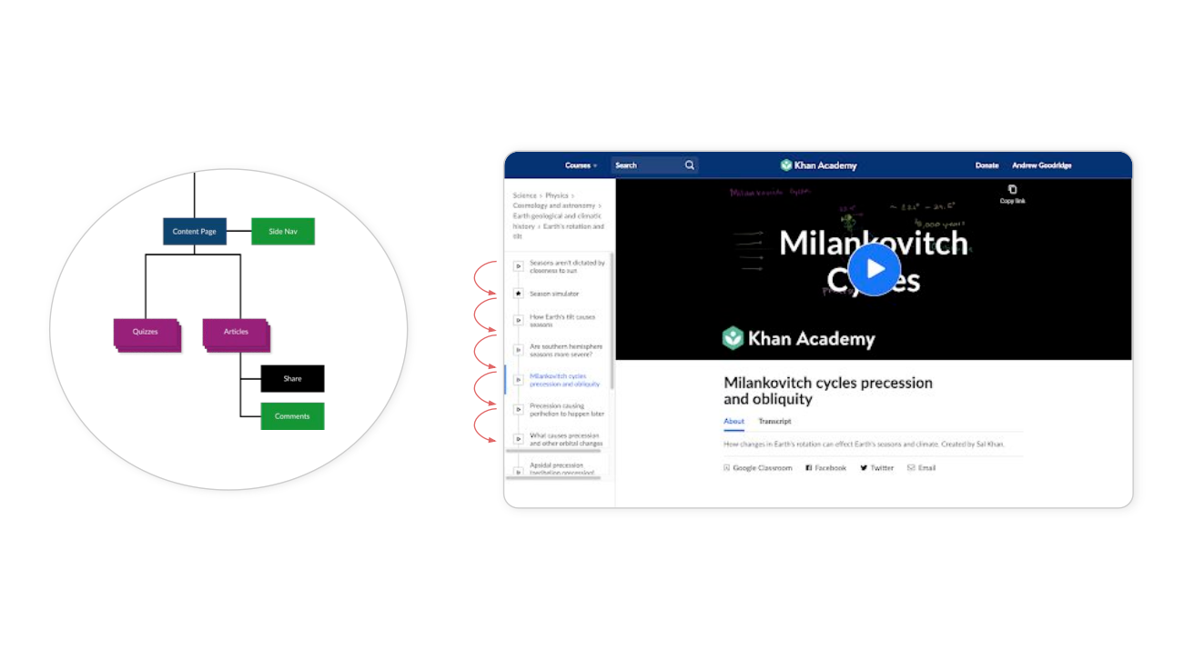
Once in “Content Page”, the system becomes Sequential, moving through a specific course curriculum. The Content Page contains a local navigation to provide transparency to the users.
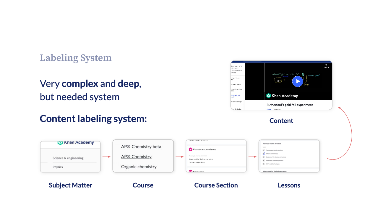
Labeling System
Khan Academy has a very complex and deep labeling system, but its much needed since they have a plethora of content.
Icons are also used frequently to helps users memorize different sections. Photos and color-coded icons are very helpful since theres a risk of much of the content blending in with each other.
Navigation System
Global Navigation on desktop is polished and easy to use. While the "Courses" menu may be overwhelming, making it smaller would require more clicks from users. In addition, search is straightforward, however, filters are used differently on desktop and mobile. I noticed, however, that the breadcrumbs on the site are inconsistent as content becomes more specific, which makes it harder to understand how deep users are on the site.
Opportunity Areas of Focus:
After concluding my analysis, I derived three insights that would guide my improvements:
- It takes far too long to get from home page to content page to start learning.
- Desktop and mobile platforms don’t interact with each other very well and seem like two separate systems in certain areas.
- Many labels are vague and redundant, leaving users confused.
Resolve
Improvement Opportunity #1
Problem: It takes far too long to get from home page to content page to start learning
Solution: Improve user flow so that users can get to sequential content quicker and easier.
I first started by restructuring the user flow in the site so that it was easier to get from the home page to the content page by adding a "Resume Lesson" button to the home page. I also got rid of the “My Stuff” and “My Account" tabs and condensed them to one page to increase efficiency.
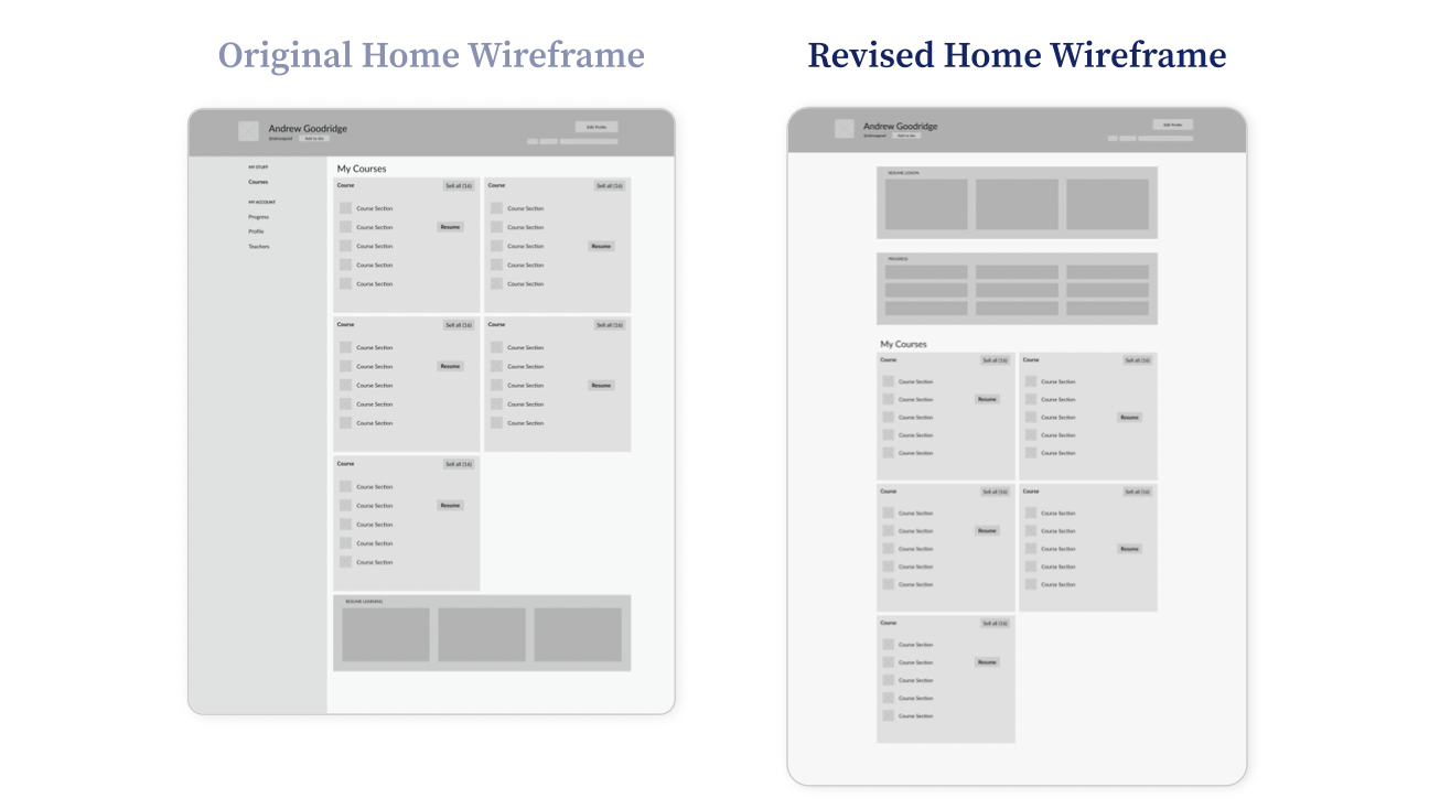
With the design of the components, I removed side navigation and move the Progress component to the front page. I also moved the Resume Lesson component to the top of the page to support the common user flow.
Improvement Opportunity #2
Problem: Takes far too long to get from home page to content page to start learning
Solution: Incorporate elements such as Bookmarks into desktop navigation to improve consistency between platforms
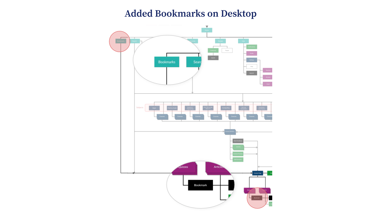
In the sitemap, I also added Bookmarks to global navigation. This way, the desktop platform and the mobile platform are connected in a more intuitive way. The bookmarks go directly to the Content page.
With the global navigation design, I made Search smaller and moved Bookmarks next to it to promote the addition of bookmarks on the desktop platform. A submenu opens on hover for easy access.
On click, opens pop-up menu for easy access.
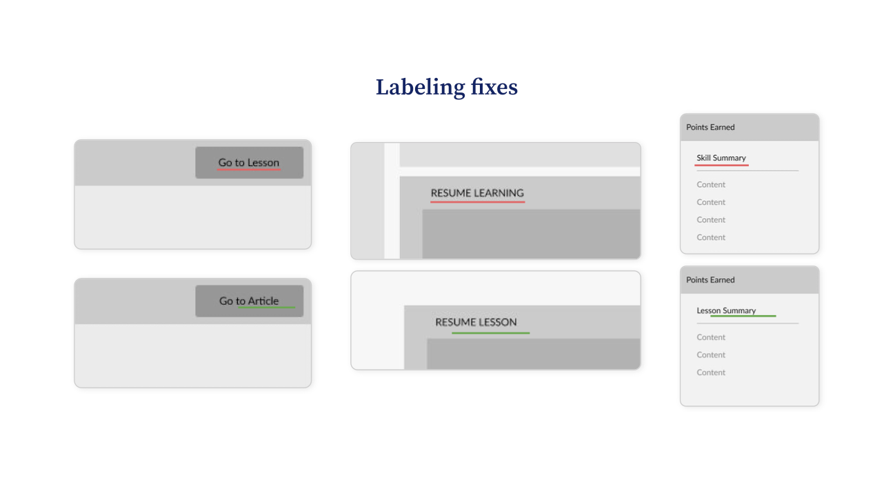
Improvement Opportunity #3
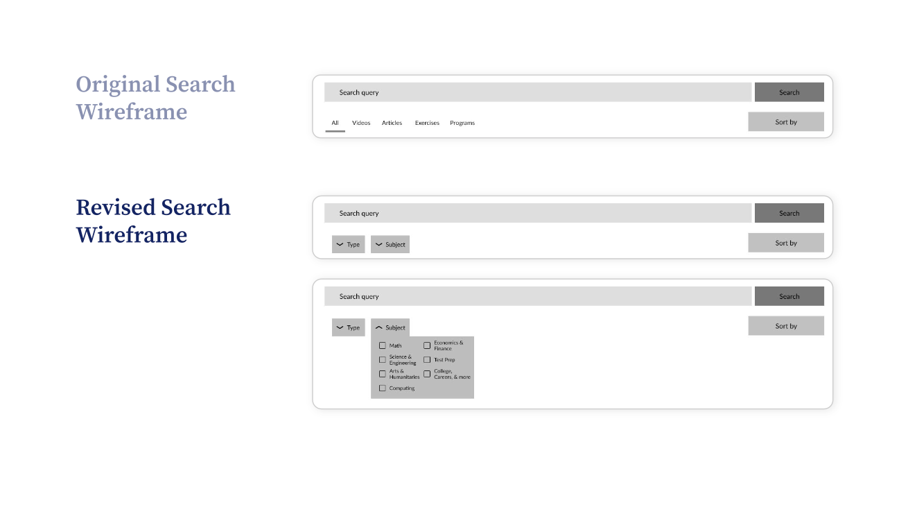
Problem: Many labels are vague and redundant, leaving users confused
Solution: Fix labeling issues to reduce confusion among users
Lastly, I fixed many of the labeling inconsistencies littered throughout both the mobile and desktop platforms.
To read more about this project, feel free to check out my full presentation linked here!
Feel free to email or DM me on any of my socials. Lets make something happen :-)
hey@ndrewgood.comWebsite made with ❤️... and code.