Moment
UX Project
Date
Sept. '20 - Nov. '20
Tools
Figma, Adobe CC, Arduino, Miro
Description
Moment is a product that provides mobility independence for individuals with visual impairment, including both a wearable device which provides directional haptic cues as well as a mobile app to alleviate the stress of preparatory stages.
My main role in this project was to lead the creation of the physical prototype, connecting various physical components together using Arduino. I also had significant parts with the research and vision video.
This project was created for Professor Clark DeLashmet's Prototyping with Electronics class at SCAD.
Collaborators
Zachra Pradipta, Edie Alvarado, Yeji Han, Andrea Guth, Erin Mills
Links
Adaption to Rapidly Changing Environments
When our group started to brainstorm areas of interest for our project, we started to think about how much change has happened in 2020. As we started to list different changes in our lives, we realized that a lot of these changes may be disproportionately harder to adapt to for people who are visually impaired. Changes from social distancing to different sidewalk layouts have left behind those who can't rely on having perfect vision. How can we eliminate these struggles of adapting to vast and drastic environmental changes that disturb mental maps?
Throughout our 10-week project, we had kept close contact with multiple individuals whose vision range from being partially impaired to completely blind. They have guided the research and development of our product to accurately design for our target audience.
Our Solution
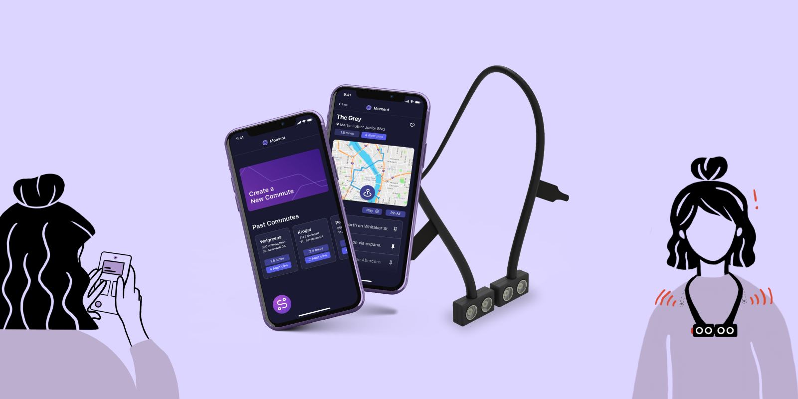
Moment is a product that provides mobility independence for individuals with visual impairment. It has two parts of it which include:
- A wearable device that provides directional haptic cues to help users avoid obstacles in public environments. The dual haptic motors use a simple haptic language to provide useful information.
- A mobile app to alleviate the stress of preparatory stages in commutes, allowing users to save routes, create custom commutes between multiple locations, and pin haptic alerts to be sent to your device at specific directions on your route.
Plan for your journey
With the Moment app, keep track of your routes by adding them to your commonly used ones. Add multiple destinations together to create your commute. All interactions are designed to be navigated via touch or voice, with ALT text connected to all labels.
Keep your commute adaptive
Instead of memorizing specific directions, have them read back to you while also being able to add new destinations and update your route. Pin specific or all directions so that you get haptic cues to make sure you're going in the right direction.
Understand your surroundings
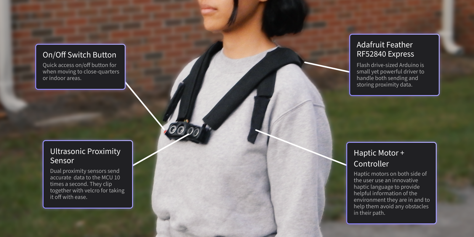
The Moment wearable device keeps track of your surroundings and notifies you of them via haptic feedback. It's designed to be slim enough to comfortably wear but solid enough to give accurate information. Use the app to adjust distances, haptic strength, and even the haptic language yourself.
Making our concept come to life
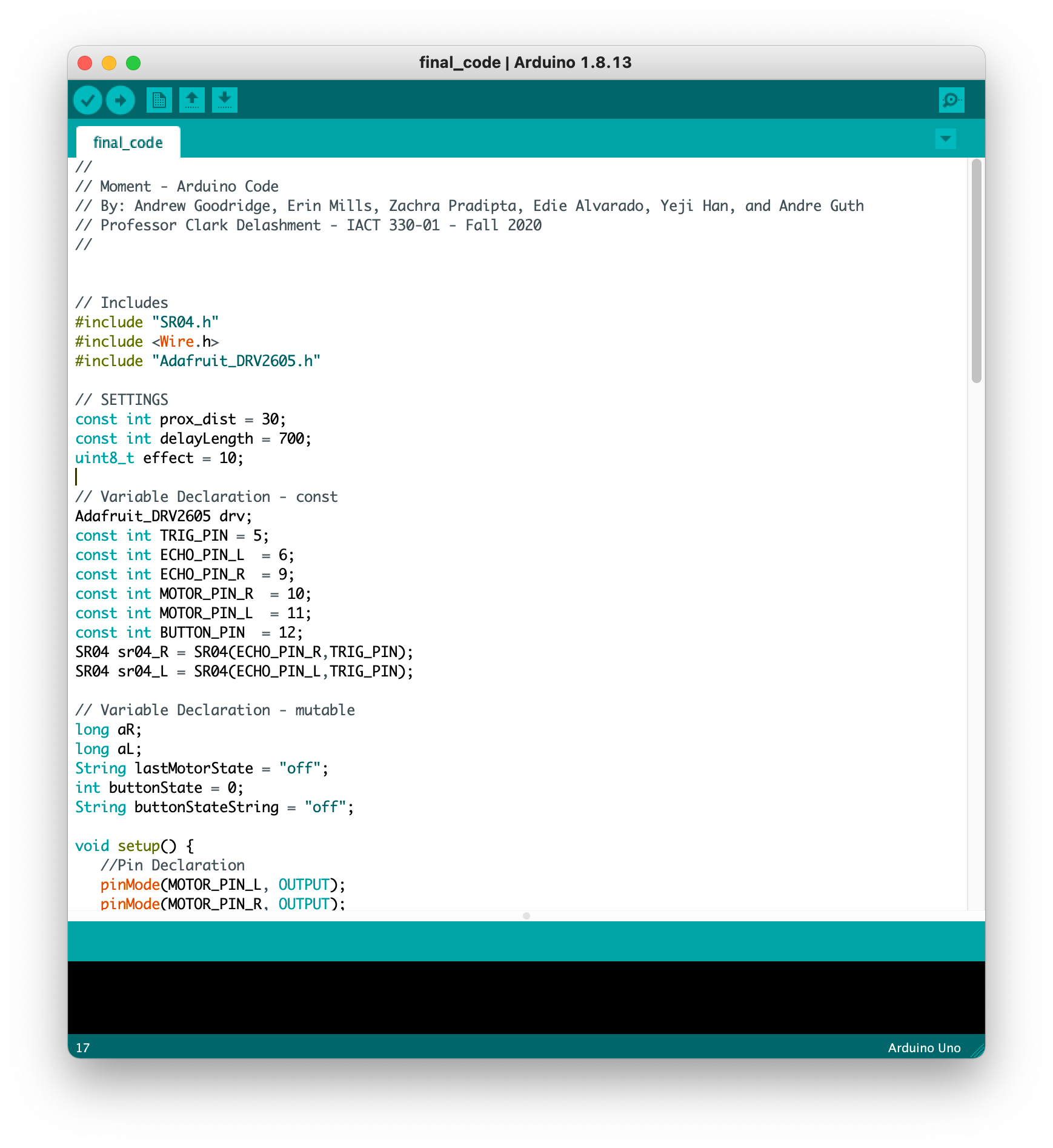
One of the final deliverables of our class was to have a working Arduino prototype. I was tasked with leading this part of our project, including researching the best components for our device, assembling them so that they fit together and are correctly powered, and coding the Arduino so that all the components work together in unison.
This was my first time using Arduino, and while there were many failures in the process of making this device, I'm very proud of our final working prototype and excited to continue using Arduino in the future.
Research
It was crucial for our team to have research fuel every design decision we made with our product, so we conducted extensive research throughout our 10 weeks, from initial secondary research to high-fidelity user testing. We had many digital interviews with people across the globe that helped guide our research and development.
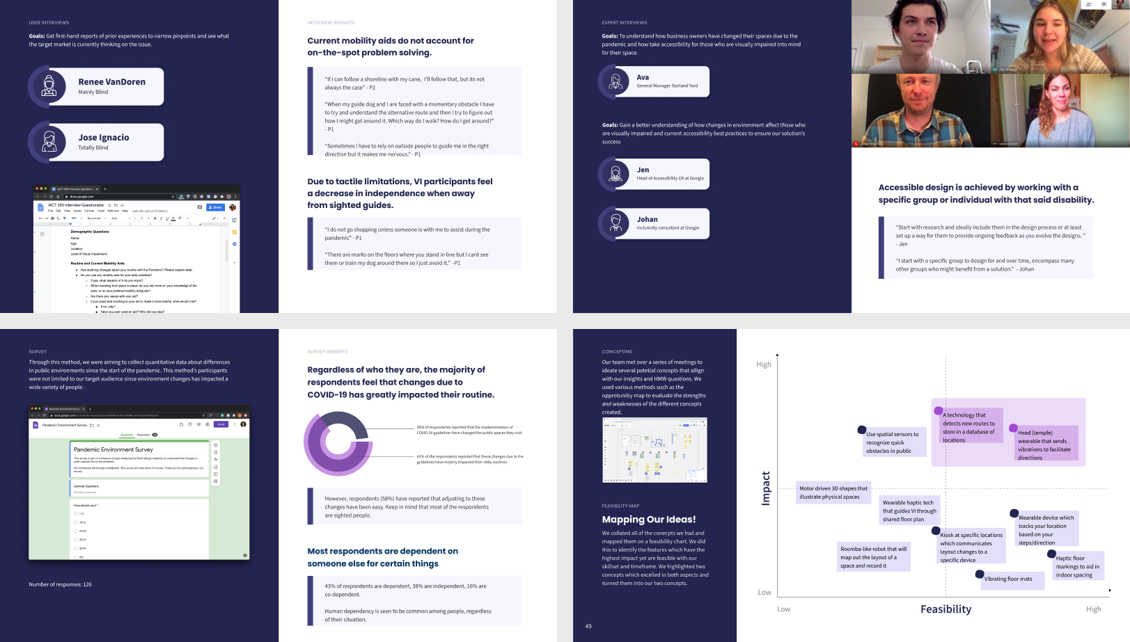
After our first round of research, which included competitor analysis, two user interviews, three expert interviews, and 126 survey responses, we derived three main insights that would drive the development of our concept.
Key Insights
- Momentary decision making: Current mobility aids do not account for on-the-spot problem-solving.
- Supplementary Sensory Inputs: Due to tactile limitations, visually impaired participants feel a decrease in independence away from sighted guides
- Environment Preparation: Individuals who are visually impaired place a large emphasis on preparatory routines prior to leaving the house.
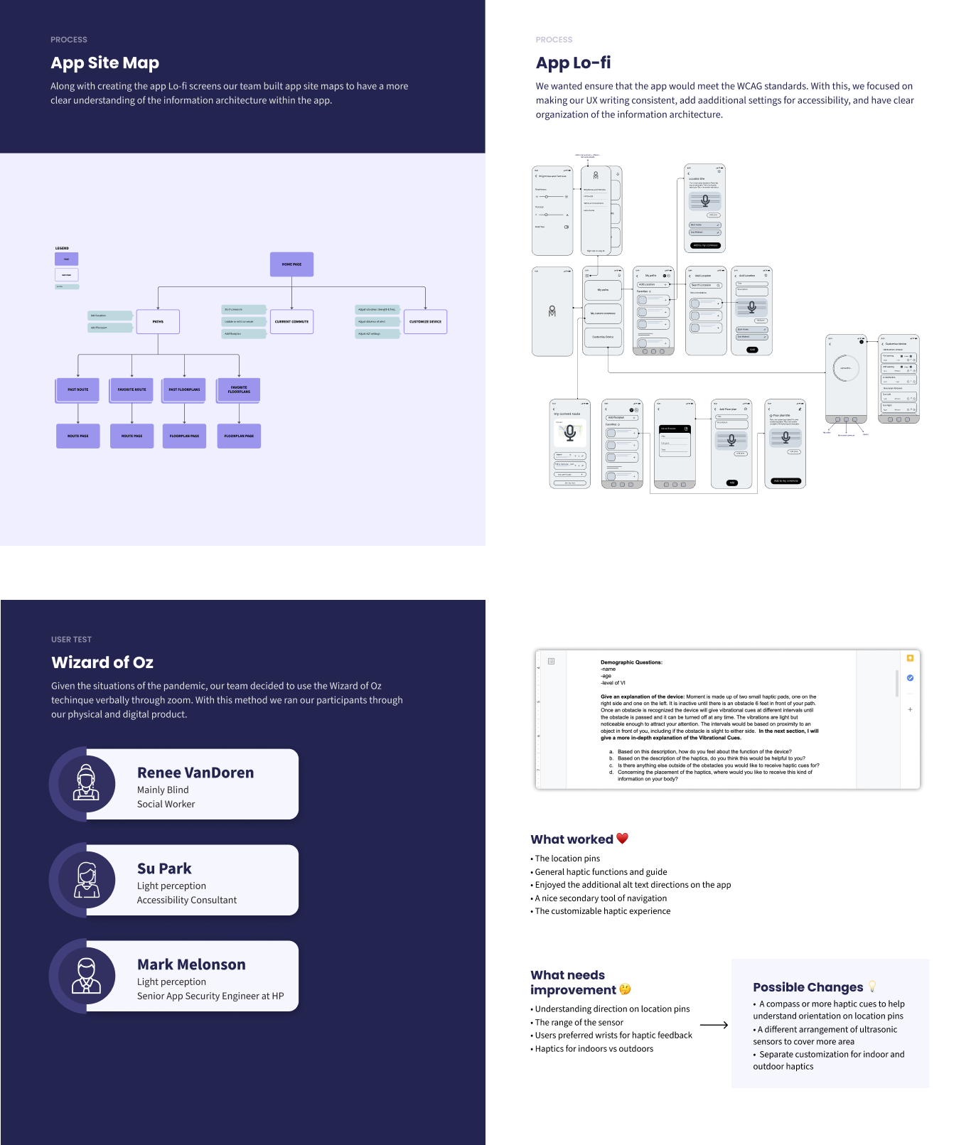
As we developed our product and make it come to life, we continually user tested both our digital app and our physical device. While we were not able to meet in person for user testing with participants who are visually impaired, we conducted multiple "Wizard of Oz" tests to simulate different scenarios with our product. This helped us shape our product to be as successful as possible.
To view our full project, please check out our process book. Thanks for reading! 😄
Feel free to email or DM me on any of my socials. Lets make something happen :-)
hey@ndrewgood.comWebsite made with ❤️... and code.